
Website sections:
- Services Provided
- IT Project Management
- Application Development
- Creativity Management
- Previous Work Experience
- Site Map
- Contact Information
Current section's content:
- Overview of Application Development
- Computer Application Development Process
- Subject Matters and Workflow Role in Application Development
- Website Layers of Qualities
- Page-Level Navigation Problems
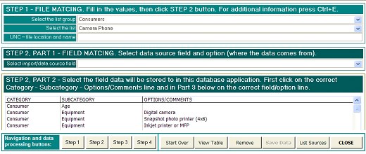
- Increasing MS Access mdb File Operating Speed
- CRM Sales Software Selecting and Customization Processes
- Overview of Sales Software Selecting and Customization Articles
- What CRM Sales Software Is Right For You?
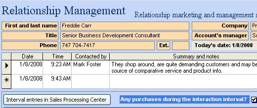
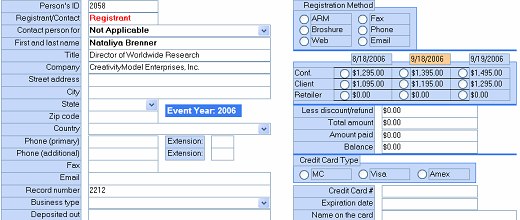
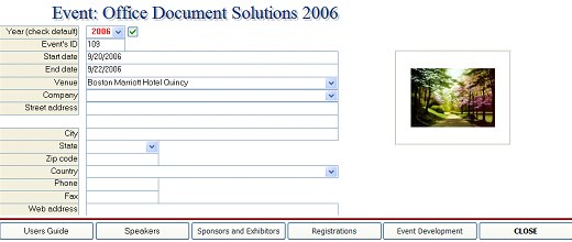
- Sales CRM Example

Page-Level Navigation Problems
Navigation problems can occur on both site level and page level. Accordingly, navigation structure that helps to minimize navigation problems can be implemented through both website and webpage structures. Examples of site-level navigation problems are difficulties with identifying the present location in reference to other sections and pages and finding specific site areas and pages of interest. Examples of page-level navigation problems are difficulties with finding specific information, misinterpreting information because of page (that is, user interface) layout and unintended skipping of some information. This article addresses these page-level navigation issues.
User interface design is a bit like story telling. Like good story telling engages the listeners and leads them from introduction to the next part, good user interface design anticipates certain user need sequences and eye movements. In addition, like a story starts from somewhere, user interface design anticipates that visitors start from a certain spot on the screen.
User interface design should be a story that the target markets like to follow. That is, user interface design should be driven by the target markets' needs and wants. Different target markets may have different needs that may have to be either balanced or prioritized.
Meeting existing customers needs should be one of the top priorities because keeping existing customers is several times less expensive than finding new ones. For example, if a company uses its website to communicate with its customers and most visitors can be expected to use the "Sign In" feature first, then that feature should be placed so that it stands out relative to other elements on the screen. Qualities make sense only in comparison. Whether something stands out or not depends on its surroundings in addition to its own characteristics. For example,
| SIGN IN |
stands out here in a separate line, having a different font size and background color. However, it is much harder to notice in this example (click here to see figure 1-1) This intentionally messy page is an example of seller needs-driven design that tends to communicate "We want to sell you this and that and that's OUR priority!" Even though the problems portrayed on this page are exaggerated, they are not far from some real life examples.
The most common user interface design mistakes are related to attempts to fit as much information as possible on the computer screen. For website visitors it is the flow of information that matters the most, because well-organized information flow is what makes navigation enjoyable. The latter is especially important if information is complex or needs to be evaluated carefully.
The more informatively saturated the webpage is, the more navigation challenges can occur, and the simpler should be the page structure.
From the visitors perspective the complexity of user interface design depends largely on how many general information flow directions the design contains. The objective is to minimize the number of information flow directions a page design contains. Keeping that in mind we can say that single-directional user interface design is preferable to two-directional user interface design, which is preferable to multi-directional user interface design. Following examples help to illustrate these statements.
Single-directional user interface design contains only one general information flow direction.
Figure 1-2. Single-directional user interface design.
| 1 |
| 2 |
| 3 |
| 4 |
| 5 |
| 6 |
| 7 |
| 8 |
Figure 1-3. Single-directional user interface design.
| 1 | 2 | 3 | 4 | 5 | 6 | 7 | 8 |
Figure 1-4. Single-directional user interface design.
| A | 1 |
| B | 2 |
| C | 3 |
| D | 4 |
In the above example A, B, C, D and 1, 2, 3, 4 are different type of information (e.g. text and ads, or text and ads plus optional additional information remotely related to the text). Similarly, 1 through 8 in figures 2-2 and 2-3 are different units of information. Another single-directional user interface example could be the text and subsection that you are reading now.
Two-directional user interface design contains two general information flow directions. Unless the two-directional user interface design is mixed with another structure it can be managed without any trouble in most instances.
Figure 1-5. Two-directional user interface design.
| 1 | 2 |
| 3 | 4 |
| 5 | 6 |
| 7 | 8 |
Figure 1-6. Two-directional user interface design.
| 1 | 5 |
| 2 | 5 |
| 3 | 7 |
| 4 | 8 |
Figure 1-7. Two-directional user interface design.
| Column A | Column B | Column C | |
| Row D | AD | BD | CD |
| Row E | AE | BE | CD |
| Row F | AF | BF | CF |
In the above examples 1 through 8 and AD through CF are related units of information.
Multi-directional user interface design contains multiple general information flow directions. It is much more difficult to follow than the above examples and in most instances at least somewhat distractive and confusing.
Figure 1-8. Multi-directional user interface design.
| A1 | 1 | ||
| A2 | 2 | ||
| B1 | 3 | 4 | |
| aa | 5 | 6 | |
| bb | 7 | ||
| cc | 8 | 9 | 10 |
| xy | 11 | 12 | |
In the above multi-directional user interface design example 1 through 12 are related units of information, A1, A2 and B1 are all units of optional additional information that is closely related to 1 through 12. The optional additional information does not follow the main information units (1 through 12) but is in a separate column. That separate column contains also other information that is remotely related to the main information units and the optional additional information units.
In this last example it's easy to miss 4, 6, 9, 10 or 12. In addition, readers may not notice A1 and other units of information at all, especially if by the time they would become interested in the information these units provide they have scrolled down and these units of information are no longer visible on the screen.
If the above examples seem little bit too abstract, take a look at some information delivery oriented e-commerce sites. For example, take a look at different sites that sell books. Some of them have excellent navigation structures while others practice multi-directional user interface design. The same applies to sellers of communication services and other information delivery oriented e-commerce sites.
It's easy to test whether user interface is multi-directional or not: if you follow the text and are actually interested in what you read (as the target market is expected to be) then in how many directions does the general information flow take you? In how many directions do your eyes move?
From the visitors perspective the above analysis applies to both obtaining information (for example, reading text) and to inputting information (for example, filling in forms and data input). Multi-directional user interface design is more difficult to follow and is hardly ever a good solution.